Apple Inc. is a giant in the tech world, known for its groundbreaking products that change the way we live. At its core is the famous Apple logo, recognised everywhere. What does this logo really mean? In this blog, we dive deep into the story behind the Apple emblem. We’ll look at its history, the various interpretations people have of it, and how it greatly shapes our perception of the Apple brand.
As experts in logo design in Australia, we understand the power of a strong symbol. Join us as we unravel the significance of the Apple logo, showing you the expertise and insight we bring to the table.
The Story Behind the Apple Symbol
The Story of How the Apple Logo Came to Be
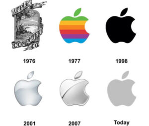
The adventure of the Apple symbol started back in 1976, but it wasn’t the straightforward, polished icon you’re familiar with now. Initially, it was a detailed drawing showing Isaac Newton sitting under an apple tree. Steve Jobs, aiming for a logo that was more up-to-date and welcoming, decided to switch to the famous bitten apple design that’s recognised around the world today.
We understand the importance of evolving a logo to keep it fresh and relevant. This story from Apple’s history is a great example of how a brand can refine its image to better connect with its audience.

Image Credit : Graphic Art News
How the Apple Logo Changed Over Time
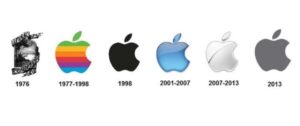
Rob Janoff, the designer behind the Apple logo, added rainbow colors to it in 1977. This change was to highlight the color capabilities of the Apple II computer. As the years went by, the logo was simplified to a single color, reflecting Apple’s commitment to a sleek and straightforward design.
In our expertise, we see this evolution as a brilliant move. It showcases how adapting a logo can align it more closely with a brand’s evolving identity and design philosophy. This story of the Apple logo’s transformation is a perfect example of thoughtful design in action, something we strive for in all our projects.

Image Credit : Graphic Art News
Decoding the Meaning Behind the Apple Logo
Various Interpretations and Theories

Image Credit: Reddit
A Nod to Alan Turing?
Some folks believe the iconic bitten apple honors Alan Turing, the computing genius, who tragically passed away after consuming an apple laced with cyanide. Yet, the designer of the logo clarified that the bite mark was added so the apple wouldn’t be mistaken for a cherry, putting to rest the idea of it being a tribute.

Image Credit: Youtube
A Hint at the Tale of Adam and Eve?
Another popular thought is that the logo points to the story of the forbidden fruit in the Garden of Eden, symbolising the pursuit of knowledge. This notion aligns well with Apple’s reputation for revolutionising how we access information.
A Symbol for Knowledge and Innovation
At its core, the Apple logo stands as a beacon of knowledge, innovation, and the courage to challenge conventional thinking—qualities that propel the company forward.
We appreciate the depth and diversity of interpretations that a well-crafted logo like Apple’s can inspire. These stories highlight the power of design in embodying a brand’s essence and values, something we aim to achieve in every project we undertake.
The Logo’s Design Elements

Image Credit: Youtube
The Change in Colors and Its Impact
When Apple moved from colorful to more simple, one-color designs, it showed their commitment to being sleek and stylish. This choice targets an audience that values sophistication.
The Unique Bite Mark
The bite mark makes the Apple logo stand out and ensures it’s not mistaken for something like a cherry. It’s a clever detail that adds to its identity.
How the Logo’s Text Has Evolved
At first, Apple used a specific font called Motter Tektura, but eventually, they chose to let the apple image speak for itself, dropping any text to highlight the logo’s powerful symbol.
Apple’s logo journey offers valuable lessons in how simplicity and thoughtful details can make a huge difference in how a brand is perceived.

Impact of the Apple Logo on Brand Identity
- How the Logo Reflects Apple’s Brand Values: The simplicity and elegance of the Apple logo mirror the company’s design philosophy, emphasising usability and minimalism.
- The Role of the Logo in Apple’s Marketing Strategy: Apple’s logo serves as a badge of innovation and quality, reassuring customers of the product’s value and contributing to its cult status.
- Consumer Perception and Recognition: The immediate recognition of the Apple logo worldwide signifies trust and desirability, standing out as a symbol of status and sophistication.
Cultural Significance of the Apple Logo
- Its Role in Today’s Culture and Media: The Apple symbol goes beyond just being a brand logo. It has become a symbol of the modern digital era.
- Comparing It to Other Famous Logos: Although many logos are known worldwide, not many capture their brand’s spirit as perfectly as Apple’s does, creating a standard in the industry.
How Logos Contribute to a Business’s Success
- The Significance of a Logo in Branding: A logo is much more than a simple image; it represents a brand’s entire personality and core values, capturing them in a single glance.
- Examples of Effective Logo Updates: Companies such as Coca-Cola, Google, and Nike demonstrate how updating a logo can signify a brand’s development and flexibility, much like Apple’s experience.
![]()
IMAGE CREDIT : Wikipedia
Tips for Designing a Meaningful Logo
- What We Can Learn from the Apple Symbol: The Apple symbol shows us how keeping things simple, memorable, and able to stir emotions and deliver a message without any words is truly powerful.
- What Makes a Logo Stand Out: A great logo needs to be unique, fit the brand, timeless, adaptable, and simple enough to look good on anything from a website to merchandise.
- Creating a Logo That Tells Your Brand’s Story: First, really get to know what your brand stands for and its key message. Then, boil these ideas down into a straightforward, yet striking visual representation.
- Connect With Your Ideal Audience: Consider who you’re trying to reach with your logo. Your design should directly appeal to them, with elements they can relate to and appreciate.
- See How Your Logo Performs Everywhere: Before you settle on your logo, check how it appears in different places—like on your website, a business card, or even a billboard. This ensures your logo always looks its best, regardless of its setting.
Conclusion
The Apple logo brilliantly shows off our creativity, greatness, and influence. The tales and meanings hidden in this logo help us realise how crucial good branding is. It teaches us that a well-made logo is not just an image—it reflects a brand’s soul. As we try to be noticed in a crowded market, the lessons from Apple’s logo are extremely useful.
If you’re looking to create a standout logo for your brand, get in touch with us! We offer custom logo designs tailored to your specific needs.
FAQS
1. What was the first Apple logo?
The first Apple logo showed Isaac Newton sitting under an apple tree, a far cry from the sleek apple design we recognise today.
2. Why did Apple choose an apple for its logo?
Apple chose an apple to represent their brand for its simplicity, memorability, and the layers of meaning behind it, including knowledge and innovation.
3. Does the Apple logo have a hidden message?
While there are many theories about hidden messages, the most accepted explanation is that the logo symbolises knowledge and innovation. The bite mark is actually there to help people recognise it as an apple, not a cherry.
4. Has the Apple logo always been the same?
No, the Apple logo has evolved over time. It started as a detailed drawing, changed to a rainbow-colored apple, and eventually became the monochromatic apple we know today.
5. Why did the Apple logo change colors?
The logo changed from rainbow to monochromatic to reflect Apple’s shift towards a sleek, minimalist design ethos in its products and branding.
6. What does the bite in the Apple logo mean?
The bite in the Apple logo is to show scale and ensure the apple isn’t mistaken for a cherry. It also adds a unique touch to the design.
7. Can the Apple logo be a good inspiration for my business logo?
Yes, the Apple logo is a great example of how simplicity, memorability, and meaning can create a powerful brand symbol. It teaches the importance of aligning your logo with your brand values and ensuring it speaks to your audience.
